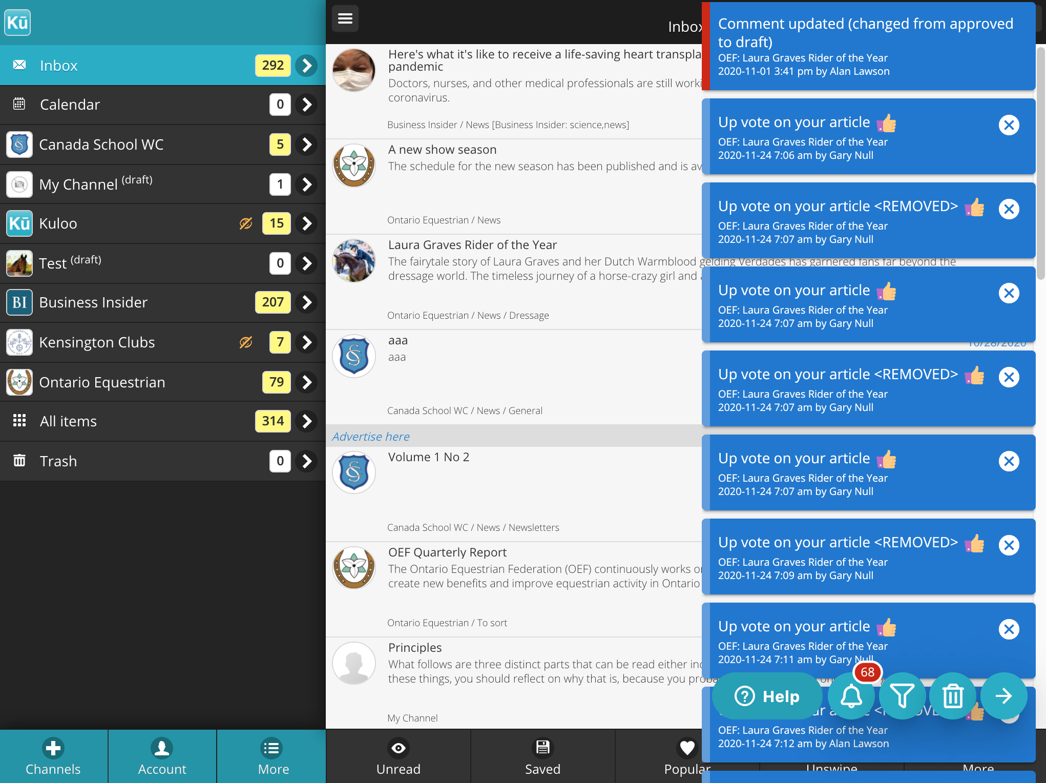
The notification system is always visible as a bell icon on the bottom right of the app screen, beside the help button.

Badge number - the upper right of bell icon displays the number of notifications received since it was last cleared. If you are an approver, this badge will turn red if there are articles or comments that need your attention.
White ring - the badge may have a white border or ring around it. This indicates that a notification filter has been enabled (see below).
Click the bell icon - the latest notifications will slide in from the right and three more buttons will appear beside the bell icon. Up to 100 notifications may be displayed at a time in this scrollable list:

The three new icons to the right of the bell icon have the following functions:
Filter - opens the popup filter to look at specific types of notifications (see below).
Garbage bin - clears the notifications list. If needed, cleared notifications can be viewed again using the "cleared" button on the filter popup.
Arrow right - closes the notifications. This slides them off screen to the right as well as the filter if it has been opened. Your current position and filter settings are saved.
Clearing notifications
Single notifications - Notificatons can be cleared individually by clicking the "X" on the right side of the individual notification.
Bulk - The garbage bin icon will clear all notifications for the current channel. If you are using the multi-channel Kuloo app and are at the main screen that displays a list of channels, notifications will be cleared for all channels.
Priority - if the "priority" filter is enabled, only the priority notifications will be cleared. Similarly, if it is not enabled, only regular notifications will be cleared and priority notifications will remain.
Click / Expand Notification
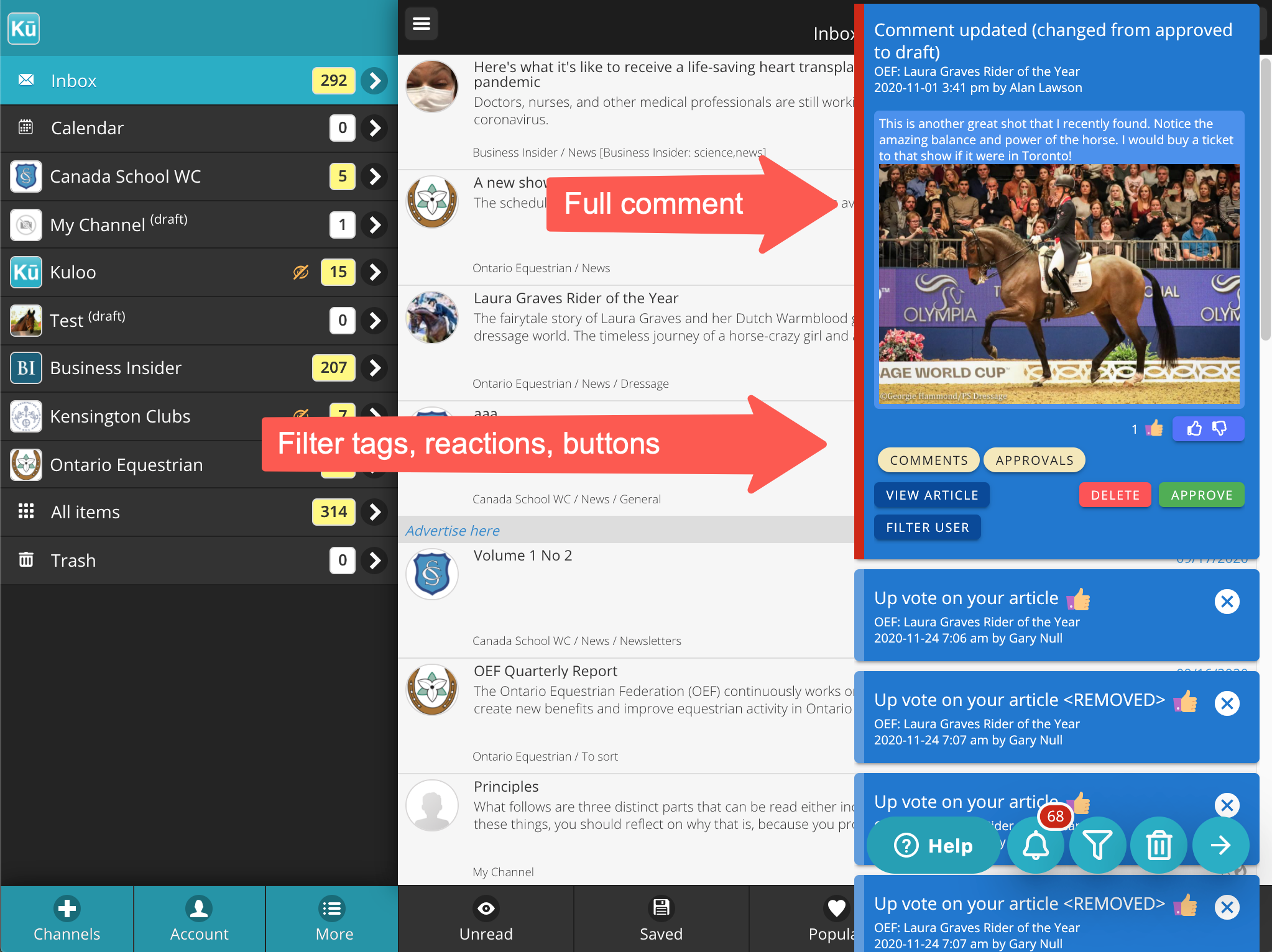
When a notification itself is clicked, depending on the type, it may expand and display more detail and/or several buttons:

Filter tags - One or more rounded beige tags indicate the filters that apply to this particular notification.
"View article" button - If the notification relates to an article, this button will open up the article itself. As the article opens, the notifications will slide offscreen so that the article can be more easily viewed. When it is closed, the notifications will slide back onto the screen at their original scroll location and state.
"Filter user" button - To see all of the activity related to the user that caused this notification, click the "Filter user" button and they will be added to the filter.
"Approve/Reject/Delete" buttons - If you are an approver and the article or comment related to this notification requires your attention, these buttons may appear to allow you to quickly handle the item without leaving your current place.
Comment Notifications
When comment notifications are expanded some unique item are displayed:
Full comment - the full text of the comment along with any images is displayed in the expanded notification. This allows you to read new comments without having to open the article itself.
Reactions - all current reactions are display in the expanded comment. Addtional reactions can be made using the indigo up/down button. The reaction popup that appears can also be used to see who all reactions are from. These reactions are updated in realtime with updates occuring in less than a second for all users.
Reply - if the comment is already approved a "Reply" button will appear that allows you to post another comment to the article (with image if needed).
Image - the expanded comment may include an image. Click on the image for full screen pan/zoom version.

Comments
0 comments
Please sign in to leave a comment.