This article assumes that you have the analytics panel open.

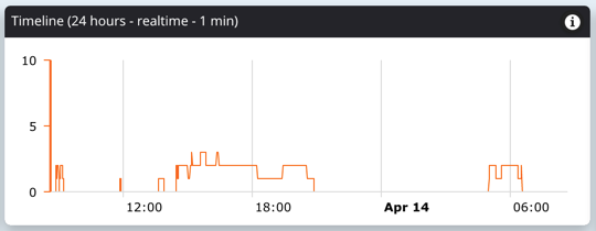
By default, the timeline graph displays number of active users for each moment in the past 24 hours. The title of the graph lists the total time span as well as the period of each tick on the graph (ie. 1 min).
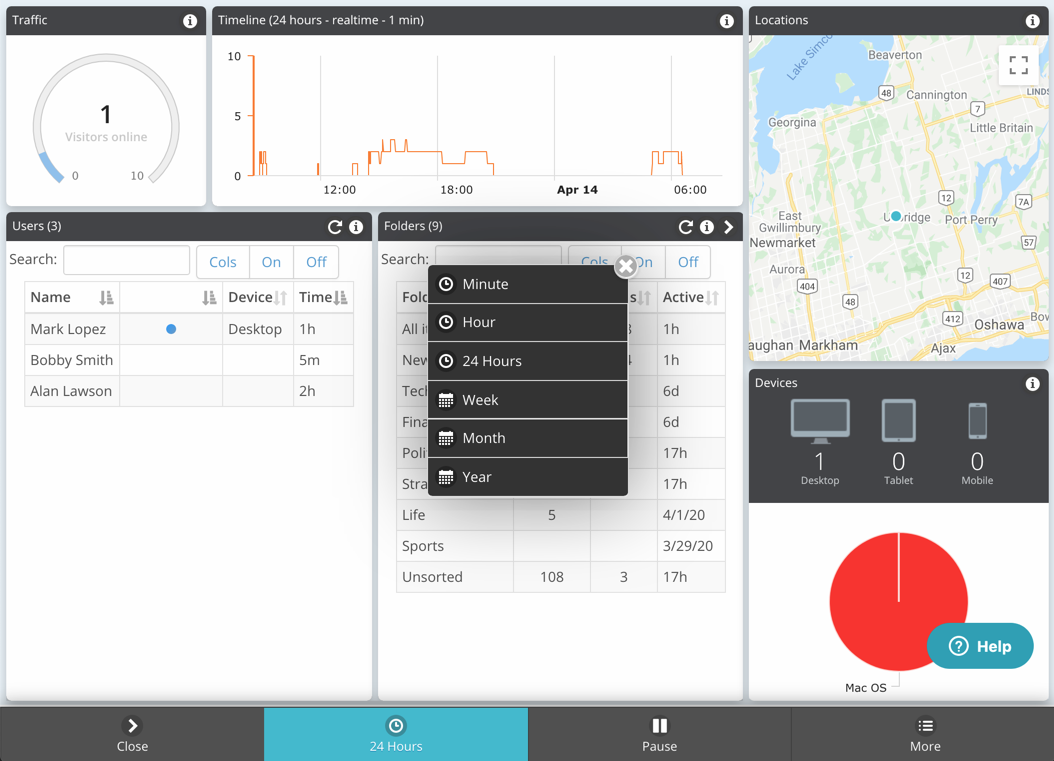
The period is controlled by the clock button on the bottom bar. The text on the button displays the current period.
The clock button can set the period to the last minute, hour, day, week, month, or year:

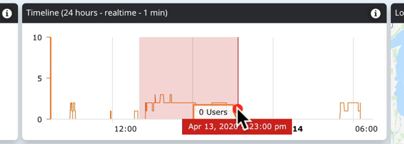
Zooming the graph can be done by dragging the cursor over the target section of the graph:

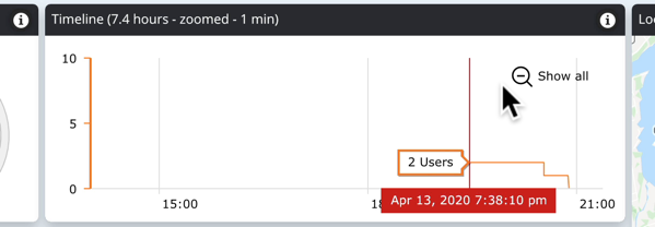
Zooming out is done by using the "Show all" icon on the graph. On touch devices do a quick tap the graph to set the start of the selection and then drag to set the span:

When the graph period is adjusted, the Folders, Articles, and Activity panels are adjusted to only display data for the selected period.

Comments
0 comments
Please sign in to leave a comment.